


I got the idea from this codepen. The original version has a nice gold effect linear gradient background. Unfortunately I wanted to create some half stars so I could displaying half-ratings (e.g. 4.5), and the linear gradient only really works on the full stars, so I’ve changed the background to pure yellow to overcome this problem.
The stars are pure CSS and extremely easy to implement, either directly in the Divi Custom CSS area or your Child Theme’s stylesheet.
CSS Code
Here’s the CSS code to add:
/* This is the main container holding the stars inside */
.stars {
  display: -webkit-box;
  display: -ms-flexbox;
  display: flex;
  margin: 0 auto 20px auto;
width: 250px; /* To center the stars, make this equal to: No. of stars x 50px */
}

/* A whole star */
.star {
  width: 50px;
  height: 50px;
  background: yellow;
  background-size: 150px 100%;
  background-position: 0 0;
  -webkit-clip-path: polygon(25px 0px, 10px 50px, 50px 20px, 0px 20px, 41.66667px 50px);
          clip-path: polygon(25px 0px, 10px 50px, 50px 20px, 0px 20px, 41.66667px 50px);
  -webkit-animation: rotate 5000ms linear infinite;
          animation: rotate 5000ms linear infinite;
}

/* A three-quarter star */
.threequarterstar {
  width: 50px;
  height: 50px;
  background: -webkit-linear-gradient(bottom, yellow 0%, yellow 75%, rgba(255, 255, 0, 0) 75%);
  background: linear-gradient(0deg, yellow 0%, yellow 75%, #A0A0A0 75%);
  background-size: 150px 100%;
  background-position: 0 0;
  -webkit-clip-path: polygon(25px 0px, 10px 50px, 50px 20px, 0px 20px, 41.66667px 50px);
          clip-path: polygon(25px 0px, 10px 50px, 50px 20px, 0px 20px, 41.66667px 50px);
  -webkit-animation: rotate 5000ms linear infinite;
          animation: rotate 5000ms linear infinite;
}

/* A half star */
.halfstar {
  width: 50px;
  height: 50px;
  background: -webkit-linear-gradient(bottom, yellow 0%, yellow 50%, rgba(255, 255, 0, 0) 50%);
  background: linear-gradient(0deg, yellow 0%, yellow 50%, #A0A0A0 50%);
  background-size: 150px 100%;
  background-position: 0 0;
  -webkit-clip-path: polygon(25px 0px, 10px 50px, 50px 20px, 0px 20px, 41.66667px 50px);
          clip-path: polygon(25px 0px, 10px 50px, 50px 20px, 0px 20px, 41.66667px 50px);
  -webkit-animation: rotate 5000ms linear infinite;
          animation: rotate 5000ms linear infinite;
}

/* A quarter star */
.quarterstar {
  width: 50px;
  height: 50px;
  background: -webkit-linear-gradient(bottom, yellow 0%, yellow 25%, rgba(255, 255, 0, 0) 25%);
  background: linear-gradient(0deg, yellow 0%, yellow 25%, #A0A0A0 25%);
  background-size: 150px 100%;
  background-position: 0 0;
  -webkit-clip-path: polygon(25px 0px, 10px 50px, 50px 20px, 0px 20px, 41.66667px 50px);
          clip-path: polygon(25px 0px, 10px 50px, 50px 20px, 0px 20px, 41.66667px 50px);
  -webkit-animation: rotate 5000ms linear infinite;
          animation: rotate 5000ms linear infinite;
}
@-webkit-keyframes rotate {
  0% {
    -webkit-transform: rotateY(0deg) rotateZ(0deg);
            transform: rotateY(0deg) rotateZ(0deg);
    background-position: 0 0;
  }
  100% {
    -webkit-transform: rotateY(360deg) rotateZ(0deg);
            transform: rotateY(360deg) rotateZ(0deg);
    background-position: -150px 0;
  }
}

@keyframes rotate {
  0% {
    -webkit-transform: rotateY(0deg) rotateZ(0deg);
            transform: rotateY(0deg) rotateZ(0deg);
    background-position: 0 0;
  }
  100% {
    -webkit-transform: rotateY(360deg) rotateZ(0deg);
            transform: rotateY(360deg) rotateZ(0deg);
   background-position: -150px 0;
  }
}
Installing the CSS Code
If you’re using a Child Theme, go to Appearance > Editor and past the code into your style.css file, then save it.
If you’re using Divi and don’t have a Child Theme, go to Divi Theme Options and in the General tab, paste the code into the Custom CSS section:
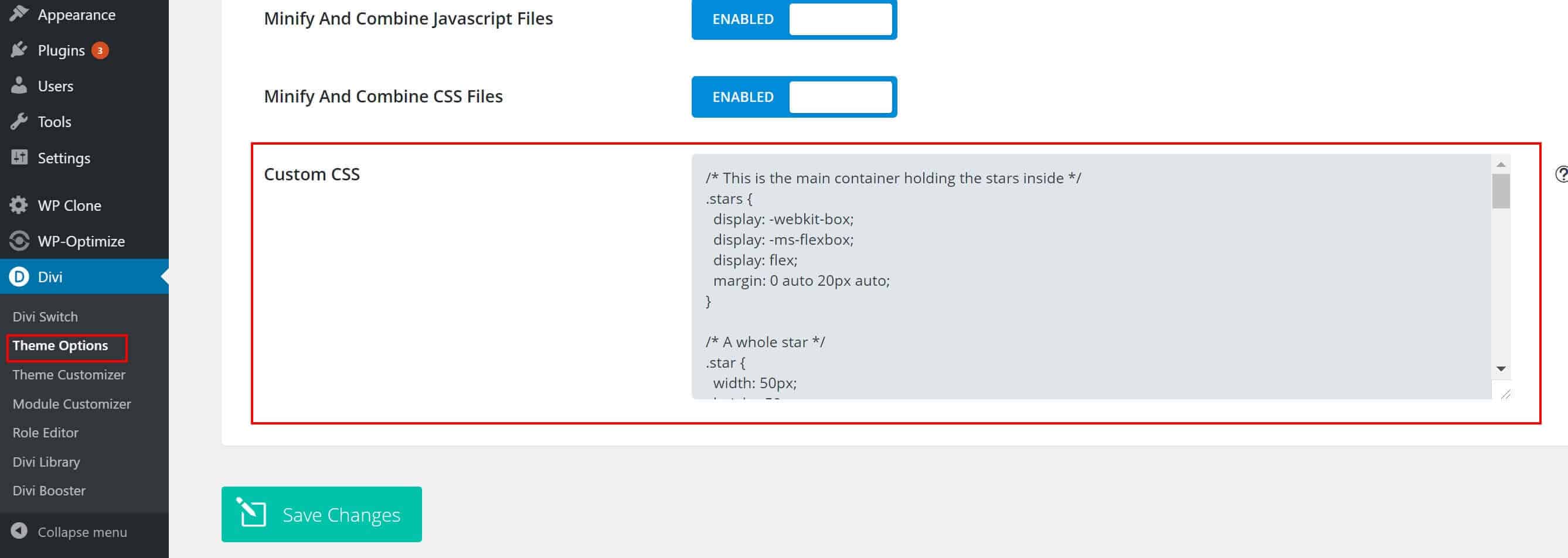
Save the changes and you’re done.
Creating the Stars
Wherever you want the start to appear, add a new Code or Text module. First add a DIV assign it a class of ‘stars’. This will be the container the stars appear inside. Add additional DIVs inside, one for each star and assign the appropriate classes to show either a full star, three-quarter star, half star or quarter star.
Here’s the example code I used in the section below to show you the different star sizes:
<div class="stars"> /* star container */
  <div class="star"></div> /* a whole star */
  <div class="star"></div> /* another whole star */
  <div class="threequarterstar"></div> /* A three-quarter star */
  <div class="halfstar"></div> /* a half star */
  <div class="quarterstar"></div> /* a quarter star */
</div>
What you get
Here’s the stars created by the html above!
I hope you found this tutorial on how to create Animated Stars for Customer Reviews useful. You can also apply the same effect to other shapes by changing the clip-path settings, or simply apply the rotate effect to images or anything else you want to rotate.
Sign up to our newsletter below and we’ll let you know when we post more tips and tutorials.
Leave a comment and have a great day!
About the Author

Ed Solman
Enqore Studio Director
Entrepreneur, Blogger and Website Designer. Passionate about helping people and businesses develop and grow. Daredevil sportsbike enthusiast.
